|
|
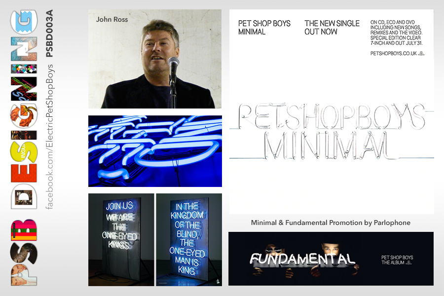
| Minimal
originally planned as the first single of Fundamental shows a similar
visual art used on the album with neon lights titles instead of regular
typography but in a minimalist way, not showing Neil or Chris and everything
over a white background, instead of bright colours over a black background,
as used in Fundamental and Im with Stupid. The authors of this work
are Mark Farrow -main Graphic Designer of the band- along with John Ross,
a recognised UK photographer famous because of working with unusual elements
like liquids or neon lights, getting amazing results on their projects.
|
| John Ross
has also worked with some other UK bands like Spiritualized and Maniac
Street Preachers showing their work in different art events. For the Pet
Shop Boys he has not only worked in Fundamental and two of its singles,
but also has been responsible for the architectural photography on Concrete,
all the photography on Disco Four and recently for the Electric photo
shooting, including its singles. |
|
|
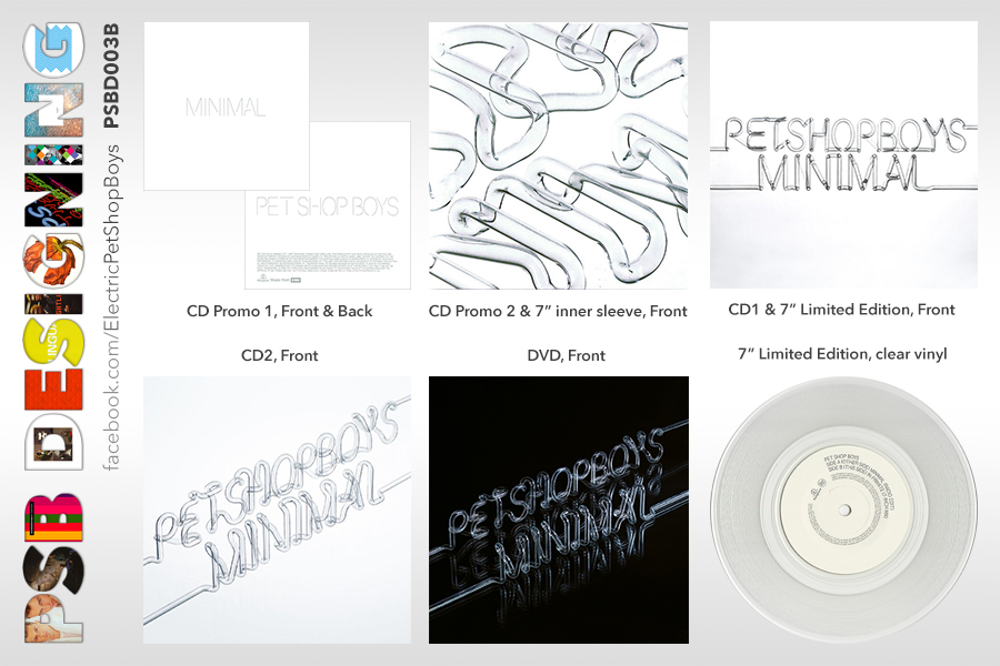
| Minimal
cover used different shots from the same image that can be read Pet Shop
Boys Minimal for all the formats realised. Just the first promotional
CD Single used typography instead of an actual shot of the neon lights
with a font simulating them (the same font was used on the Fundamental
Tour Programme). There was a second promo CD Minimal Remixes that used
a close-up shot that none of the words could be read. |
|
A
third, and last promotional 12 Single was sent to selected Clubs and
radio station DJs promoting Tigas and Telexs remixes but it was printed
on a generic die-cut black sleeve showing the white labels of the vinyl
and one of them was printed with the track list. Then there was two
CD comercial releases using different shots of the neon lights image,
then a limited edition DVD changing the background to black and finally,
a limited edition clear vinyl 7 Single issued on a double sleeve: the
outer sleeve used the same shot of the first CD and the inner sleeve
used the same shot of the second promo CD with the close-up shot of
the neon lights.
|